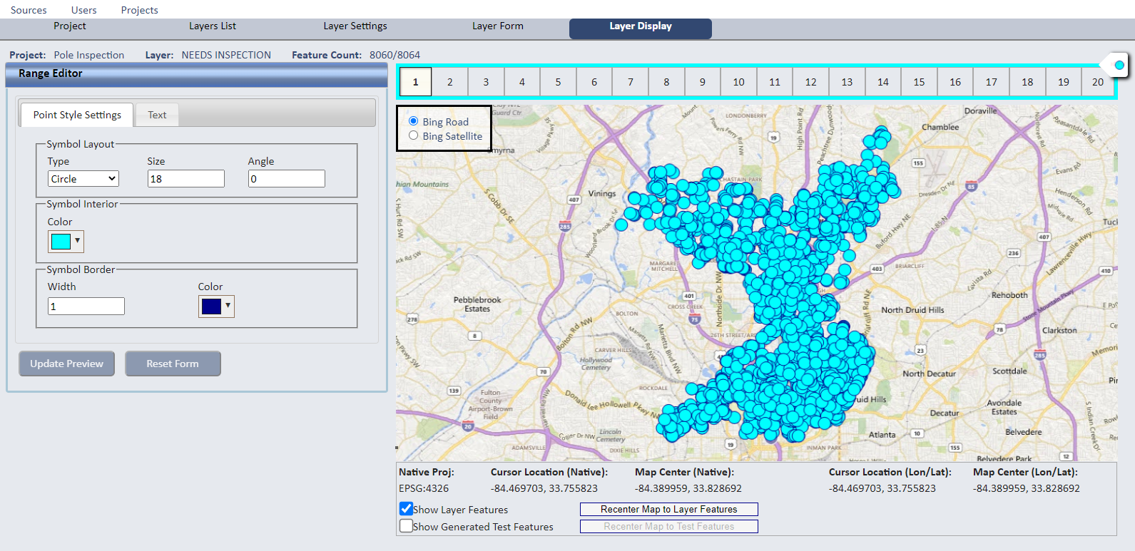
Source (and Layer) Display Styles
Select the Source Display menu item to open the Range Editor and specify how you want the features for this Source
to display in the SpatialWorx App. Display settings on this page are inherited
by any Project Layer derived from this Source.
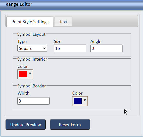
When you first add a Source for a point feature, it is defaulted to display as a blue circle (lines and polygons have similar defaults respectively).
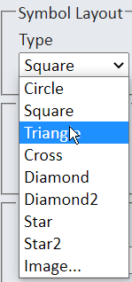
You then have an option to change that default by selecting from a library of point symbols (diamond, circle, square, etc.), sizes, and colors.
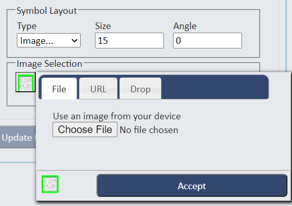
You can also select an image of your own (select the Images otion from the Type dropdown under Symbol Layout).
Images can come from:
- An image file from your computer or file system
- An image residing at a specific URL
- An image dragged and dropped onto the Drop tab of the Image Selection control
You can create your own custom symbols to use if you cannot find existing ones that suit the purposes of your Project.
First, select the symbol style or "image" from the list.
Next, choose a color for the interior of the symbol (if you didn't choose an image).
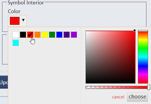
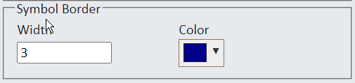
Then choose a color for the border of the symbol and width of the border.
For an image, select "image" from the list and press the image icon that displays. Then select the File, URL, or Drop tab to select and Accept the image
file you want to display in the SpatialWorx app for the Layer(s) derived from this Source.
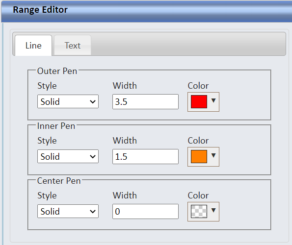
If you're setting the display settings for a linear feature, you can specify different colors for the outside of the line, the inside
of the line, and the center of the line.
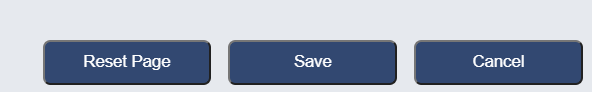
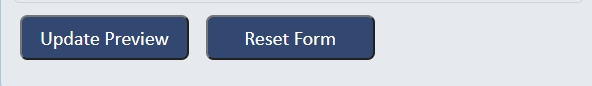
Press Update Preview to see all changes you have made in the map preview pane, or Reset Form to undo any changes you have made.
The map display pane provides a preview of how the symbology and text will display in the app at each zoom level. It also allows you to change the
basemap to see how the feature(s) will contrast with the basemap to yield the best results. If feature data already exists for the source
being defined, those features will be displayed in the map preview. If not, the system will show one or more random "mock" features so you can preview their
appearance.
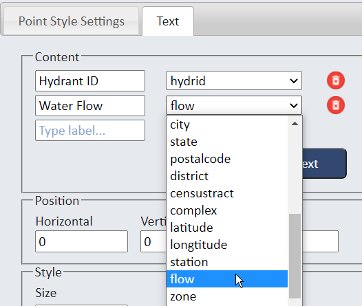
Select the Text tab to set any desired attribute values to display next to the feature on the map. Open the attribute list, select one or more
attributes, and add an optional label for each.
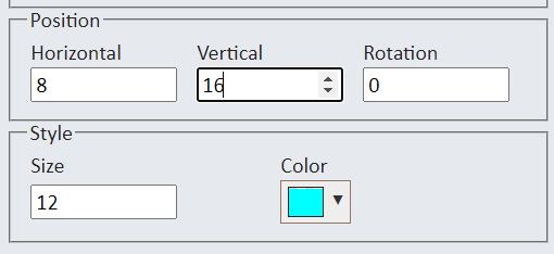
Specify where and how you want the annotation text to display (relative to the position of the feature) by setting it's horizontal and vertical offsets,
size, rotation, and color. For linear features, text is automatically drawn alongside the line at the same angle and centered on the line. For polygons it
is centered in the exact midpoint of the shape.
Here are examples depicting how annotation text displays in the SpatialWorx App.
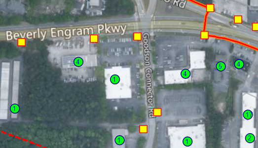
The numbers inside each building symbol (green circles) is from attribute values that indicate how many businesses are in the building.
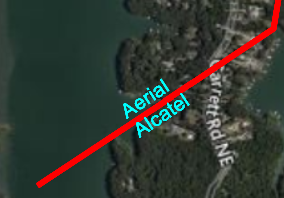
This illustrates values for 2 different attributes of this linear feature that display along its line symbol.
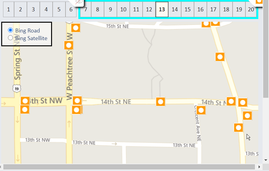
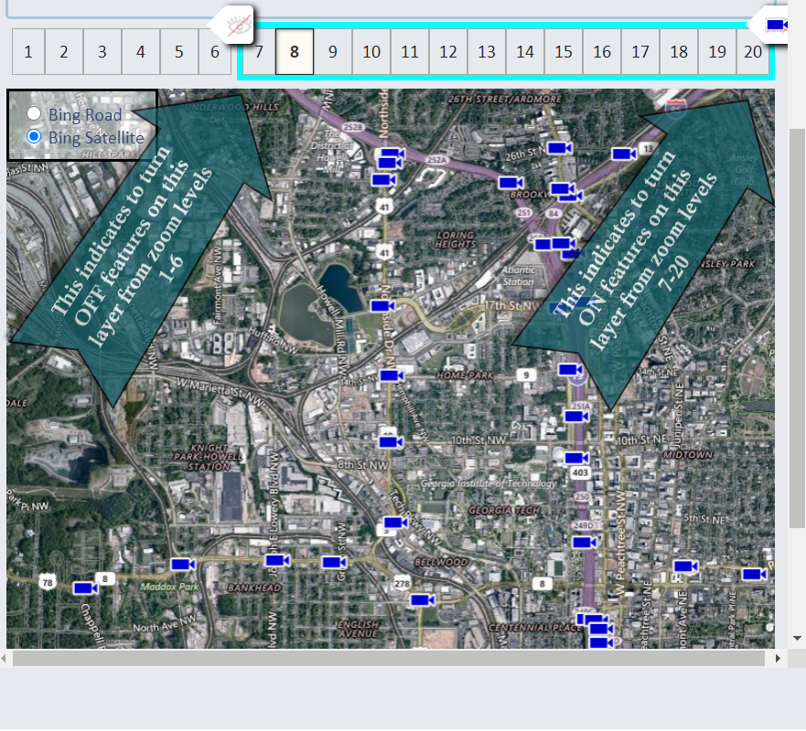
The Range Editor specifies how features display at each of 20 zoom levels in the SpatialWorx App. You can set this so that features will
display at certain zoom levels and not at others. Just move the controls shown at the top of the map left or right and select "eye" icon from
the dropdowns available on the control to turn the display ON or OFF for the range to the left of the control. The scissors icon will aplit the selected
range into 2 ranges so you can further control the desired displays.
It's important to note that you can also use this method to control the specific symbology that displays in each zoom range. For example,
you can set the symbol display
as a point (small circle) when zoomed out but then changes to a fire hydrant when zoomed in.
Or specify that annotation text displays next to the feature only when the user has zoomed in closely (you see a street number next to buildings when zoomed in).
Press Save to save all of your display settings or Cancel to discard them. Reset to change all settings back to their original state.