A Byers SpatialAge Solution
written by
Charles Raffensperger
January, 2020
When I was young my family used to take many long car trips together. You know, the kind where one of us kids would always ask "Are we there yet?". It was on those trips that I began to develop a lifelong fascination with, and love of, maps. In those days every filling station had a rack of road maps of every state. On every trip my Dad had all the requisite maps handy in the glove box as a reference for every leg of the journey.
When I was old enough to understand that those intricate pieces of folded paper were full of information about where we were going and where we had been my interest was piqued. I began asking to look at the maps while we were en route to some far off destination and I studied them intently. Roads, towns, states, cities, waterways, railroads - they were REAL places and all I had to do was to read the map to know where they were and how to get there! Helping my Dad navigate on trips became an enjoyable way to pass the time and my "job" was not only to keep us on the proper route but also to estimate how many miles we had to travel to the next stop and how long it would take to make it there.
Fast forward to my adult years where I inadverently chose a career path that would once again immerse me in the wonderful world of maps. And as part of the SpatialWorx team I have opportunity to continue to be around maps every day!
Maps help us understand the relationships between places, between things, and most importantly between people. They quite literally ground us. They make us spatially aware and the power of that awareness can inform our decisions and insights into the greater world around us.

"Maps are a way of organizing wonder."
- Peter Steinhart
A World of Maps
According to Wikipedia "A map is a symbolic depiction emphasizing relationships between elements of some space, such as objects, regions, or themes. Although most commonly used to depict geography, maps may represent any space, real or imagined, without regard to context or scale, such as in brain mapping, DNA mapping, or computer network topology mapping."
Types of Geographic Maps
There are two basic categories of geographic maps, and within each category there are many different types depending on what information they are designed to show.
- Those that depict the actual landscape, such as topographic and general reference maps
- Those that describe or comment on specific features using the landscape as a background or for context
Geographic maps encompass a wide spectrum of representations and types, all designed to depict specific relationships of objects or conditions against different landscapes or surface areas and are classified by what they are intended to show. And it's worth noting that although these map types are separated out as being distinct, it is possible, and in many cases common, to combine more than one type into a single map. This is typically done with the use of filtered display layers. For instance, the person opening the digital map might have a layer for political boundaries, another for land-use patterns, and another for climate conditions - and any/all could be turned on/off as desired to help visualize related information for a specific area or areas. Following are some of the most common types of the many different possibilities.
Climate and Weather Maps
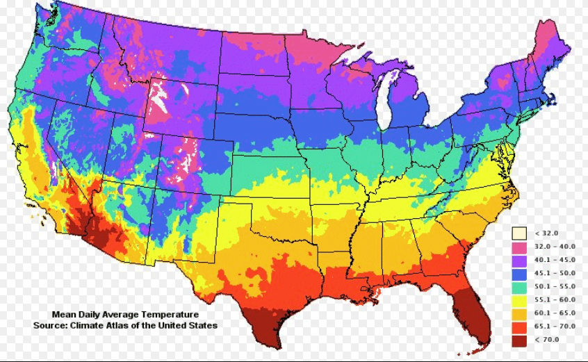
Climate maps are those that show regional conditions and distribution of a number of climatic variables such as temperature, precipitation, humidity,
sunlight percentage, rainfall amounts, wind direction, atmospheric pressure, etc. over a long duration of time, typically weeks, months, or years.
Weather maps, on the other hand, are geared more toward current conditions or short duration periods of time such as hours or days. Both types
of maps can also be used for predictive analysis or forecasting of future patterns.
Information for both types of maps is derived from long-term observations or immediate information received from satellites
or other earth-bound reporting stations. Both climate and weather maps are typically color-coded to signify different quantifiable
variables and measurements.
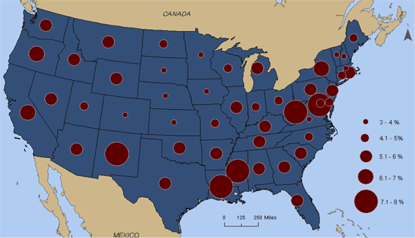
Economic or Resource Maps
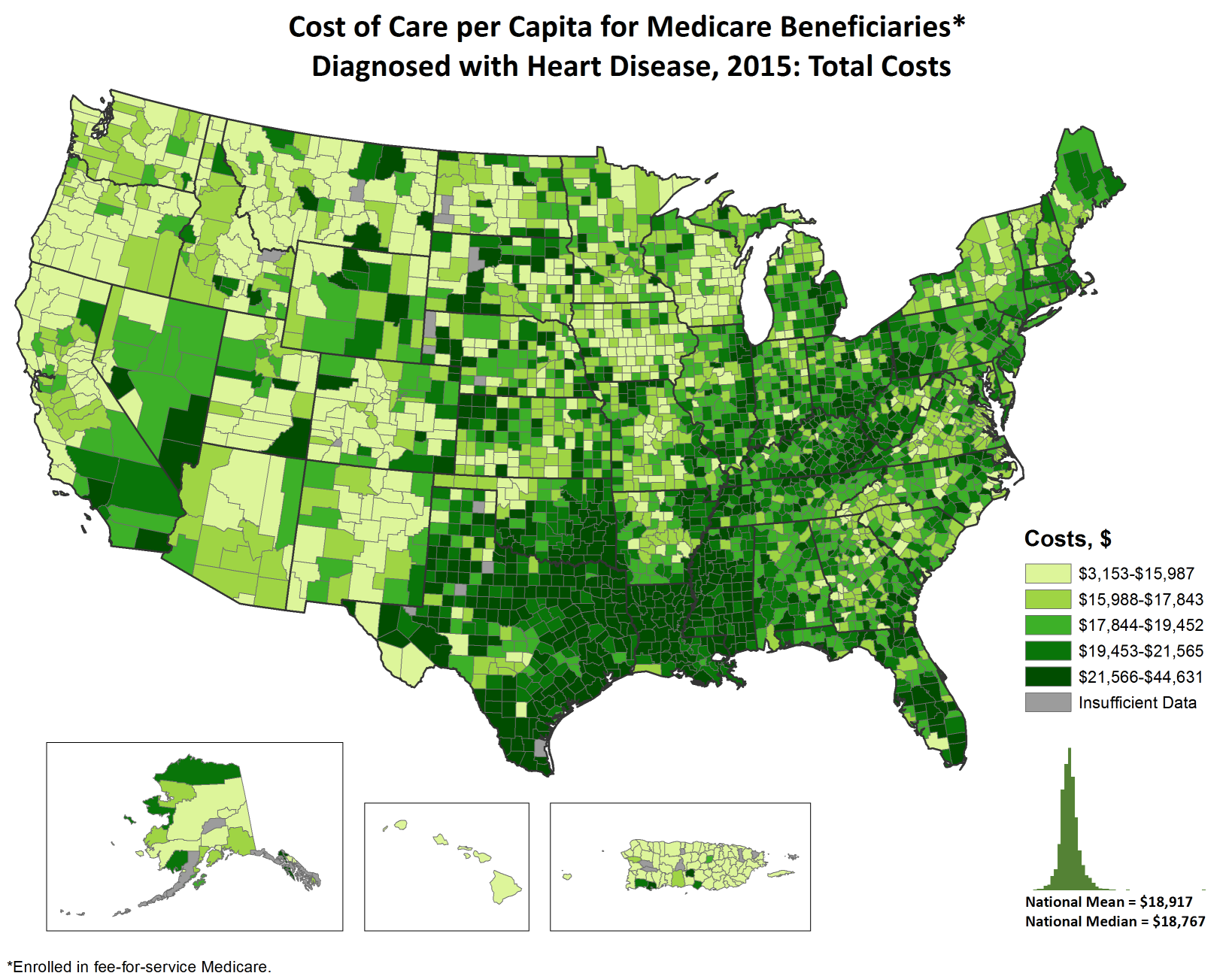
Economic and resource maps depict economic activity or natural resources present in an area through the use of different color codes
and symbols to indicate zones of economic activity or natural resources and typically include a legend used to interpret the different
zones on the map. A good example would be a map that shows the percentages of different types of agricultural land use in the American Mid-west region.
Another good example would be a map that shows mineral resources across the continent of Africa.
Maps of this type are obviously useful to many different industries.
Political Maps
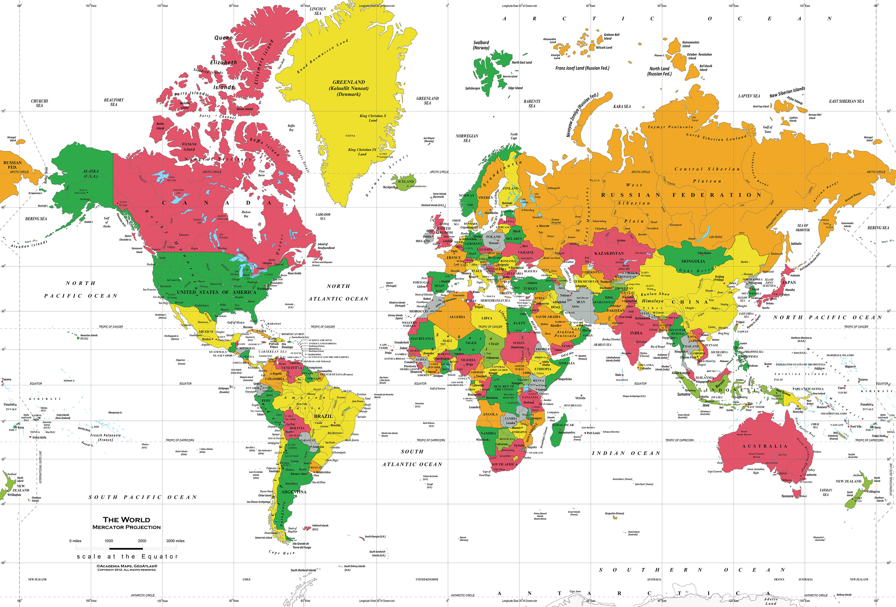
Political maps show different types of geo-political or administrative boundaries, such as countries, cities, states, provinces, etc.
and may not include physical or topographic features such as mountains and smaller waterways (although they will typically show larger waterways
simply because in many cases those form part of an administrative boundary).
Road Maps
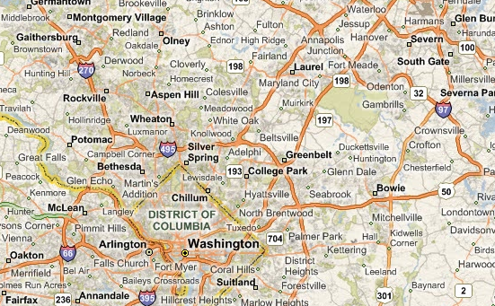
Road maps are designed primarily to display roads and other transport links, such as railroads, instead of physical geographical information.
However, they typically also display some geographic features such as waterways and also different political boundaries.
They may also include other features of interest such as buildings, parks, recreation areas, and other items for reference.
Topographic Maps
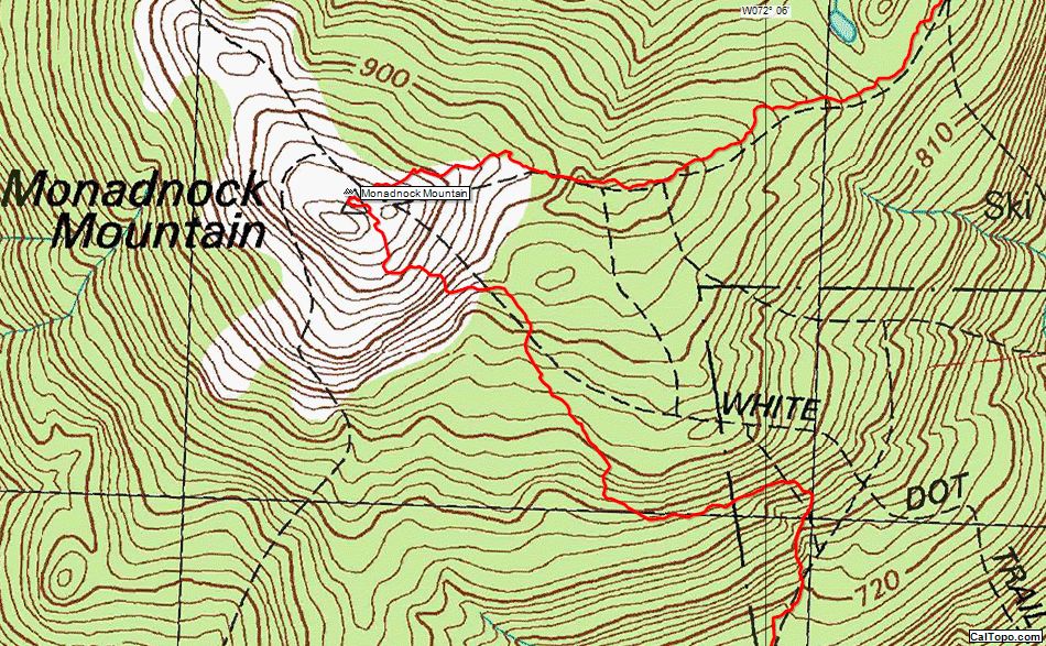
Topographic maps represent a three-dimensional area of the surface of the earth in two-dimensions. The purpose of this is to show the relief
of the land surface of an area, typically using contour lines that represent different elevations above mean sea level. This allows the viewer to read and interpret
both horizontal and vertical distances between points on the map. Most topographic maps show both natural and manmade
features, as well as some political boundaries. Contours are connecting lines indicating a specific elevation. Topographic maps are useful
to any individual or organization who needs to understand the relative contours of the earth's surface at a particular point. In industry,
for example, a real estate developer would find these maps invaluable to determine the viability of a building site. For an individual who enjoys
hiking these maps can help him/her determine the difficulty of the terrain where they are planning to hike.
Relief Maps
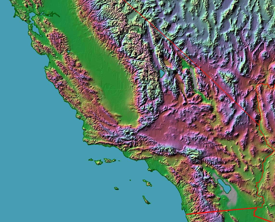
Relief maps are similar to topographic maps because they also depict the contours of the earth's land surface. However, instead of using contour
lines to indicate relative elevations they use color shading to depict relief. For instance, higher elevations might be color coded as red
while lower elevations in green. Additionally, in both physical and electronic form, relief maps can actually show the relief in three-dimensions
as raised areas on the map or three-dimensional renderings in a digital view of the area.
Thematic Maps
Thematic maps are designed to focus on a particular theme or subject within a specific geographic area. This is different than
general reference maps that show a variety of subjects such as political boundaries and natural features on the same map. They depict spatial
variations of one or a small number of variables over a geographic area. An example would be a map that shows rainfall distribution
for the month of April in Brazil.
Geological Maps
Geologic maps simply show geologic features for a specific area such as rock units, geologic strata, bedding planes, and other
structural features such as faults, folds, and foliations. Lines are shown with strike and dip or trend and plunge symbols
that give these features three-dimensional orientations.
Heat Maps
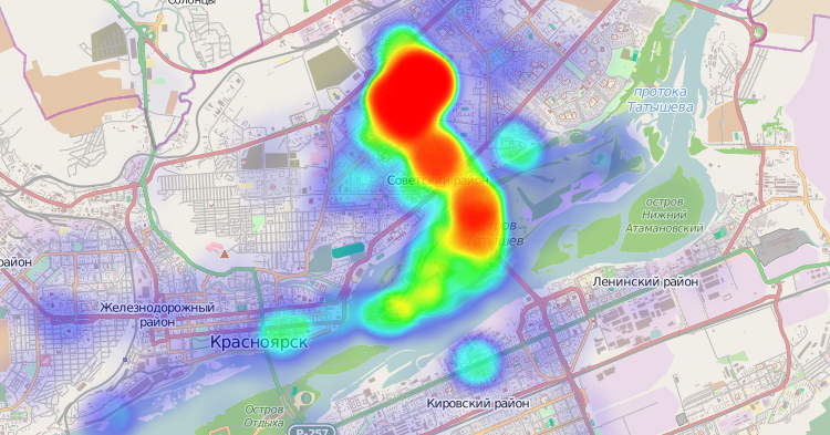
Heat maps are graphical representations of data that use a system of color-coding to represent different values. They are useful as a
data analysis tool to help the viewer visualize and more easily understand complex data sets. A simple example of a geographic heat
map would show population densities for the entire United States so the viewer could easily see which regions have a higher vs a lower
population density.