Forms Overview
Forms serve as the primary method of collecting and manipulating attribute or media data in the SpatialWorx App. When you build a form for a Source it is inherited
by any Project Layer that is built from that Source, so it in essence is a template for the Layer's form.
The Form Builder interface allows you to see all attributes from the source data, choose which ones to add to the form and in what order, specify how users
will interact with the field on the form that points to the source attribute, and add new fields to the form that don't exist in the source data. New fields
that are added to the form become new attributes of the Source.
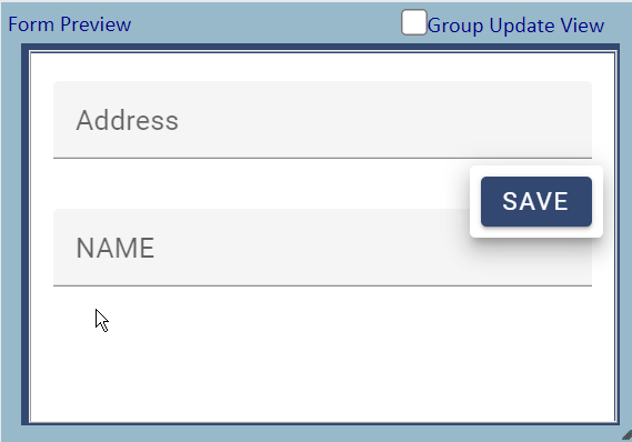
The Form Builder interface also includes a Preview Pane so you can see exactly what the form will look like when opened in the SpatialWorx App.
Building a Form
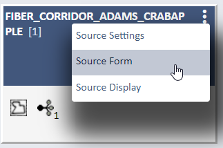
As soon as you successfully create a new Source the system will open the Form Builder page which allows you to begin building a form for that Source. For existing Sources you can open the Form Builder page by selecting the Source Form option from the 3-dot icon on the upper left side of the Source card on the Sources page.
The Form Builder page has a number of different functional areas and options, including:
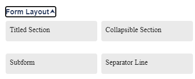
- Form Elements is a list of Source Attributes, New fields, and Form Layout fields that can be added to the Form
- Page control adds pages to the Form
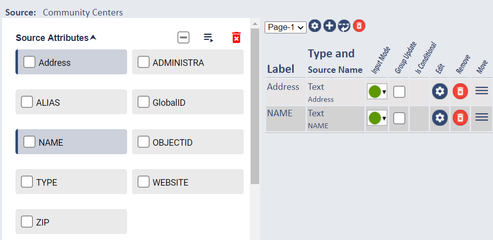
- Form Canvas is the work horse of the Form panel, listing the Label, Type and Source Name, Input Mode, Group Update, Condition, and other controls to manage how the Form appears when used in the App
- Preview provides a preview of how the Form displays in the App
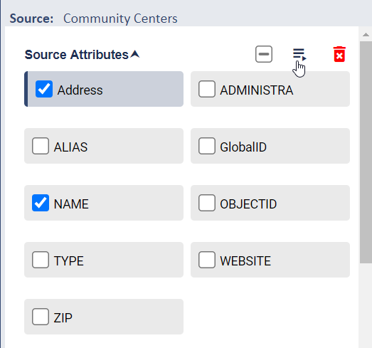
To get started building a form first open the Source Attributes option in the left pane to see a list of all attributes that are available from the source data. Then drag and drop, double click, or select/check and move the attributes you want over to the form canvas.
You will then see those attributes on the form canvas. Once there you can set the Input Mode, make then eligible for Group Update, Edit their Properties, Remove them from the form, or Move (reposition) them on the form. All attributes then become "fields" on the form that field users will see when they select a feature in the field app. By default all fields are added to the bottom of the form but can easily be moved by selecting that option and dragging/ dropping them in a different position on that page of the form.
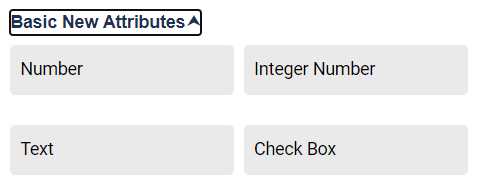
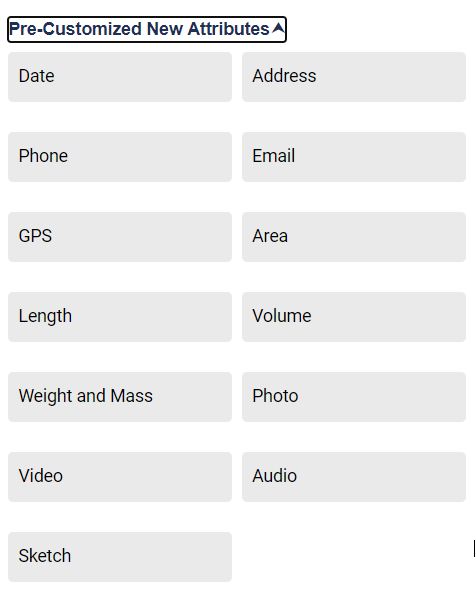
You also have the option to add brand new attribute fields to the form (where no source attributes exist), add new form layout elements, or add custom attribute fields
such as Address, Photo, etc. This allows you to customize the data field users have access to for review, update, or input so they can see just source
attributes, a mix of source and new attributes, or only new attributes.
When any new attributes are adding as fields on the form they are then saved as Source Attributes and will be available in that section of the lef pane when the
form is saved.
Subforms are essentially forms within a form and are typically used to capture child record data for a parent. For instance, for a survey of businesses
and businesses in those buildings the primary/master form holds information about the building and the subform holds multiple records for each business
or suite within the building.
For more information about Subforms and how to set one up open this link:
Subforms
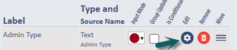
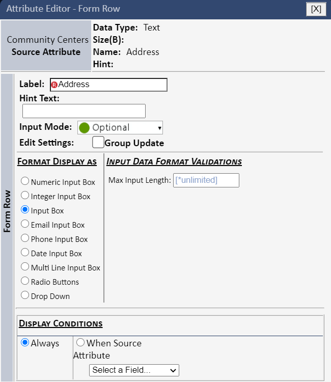
Selection of the gear icon on any row on the form canvas (that represents an element or field on the form) opens the Attribute Editor. This interface allows the user to set the Label of the field, change the Input Mode (Required, View-only, etc.), change the format of the input field (Radio Buttons, Drop Down, Text Input Box, etc.), add a list of option values for buttons or drop down input types, add Hints, and specify display conditions for the field.
Here is an example of the Atribute Editor that is opened via selection of any field on the form (this example is for a Text field - this
dialog has different options for other field types such as Number or Media.
Display Conditions are rules for hiding or showing this field on the form. For example, if you have a form for a pole inspection it might have both a
"Condition" field and a "Comments" field - so you only want users to add Comments if the value of the Condition field is "Poor". If configured
for Conditional Display the Comments field will be hidden on the form and only shown if/when the field user selects a Condtion value of "Poor".
After making any changes to the settings on this dialog select the Apply and Close button to save them and return to the Form Builder page.
The Source Form page also includes a Preview pane that updates dynamically as you add or modify field on the form. The Preview displays a blank (no data) view of what the form will look like in the SpatalWorx app.
Press the Save Form button at the bottom of this page when you have made all desired updates to build your form. It's important to note also that you can open this Source Form at any time and revise or make updates to it.